Once we were able to get support to kick off the initiative following the business case we knew that it was a necessity to reframe the challenge to focus on the end user in order to develop a sustainable solution. I collected user research from across our various business units as well as interviewed client-facing associates to understand their pain points. To balance the external experience, I also collected information from the internal and employer brand perspective. This was imperative to challenge my own assumptions regarding scope and the best course of action. Outside of direct feedback, I also conducted landscape analysis to get a better understanding of the frame of reference for these audiences and what patterns were emerging across the financial industry.
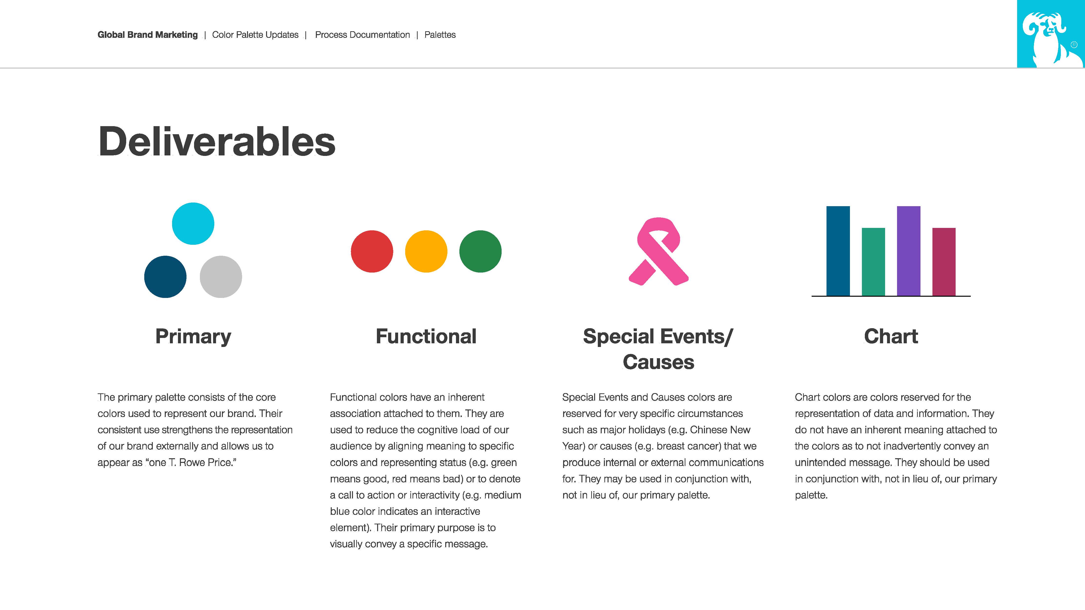
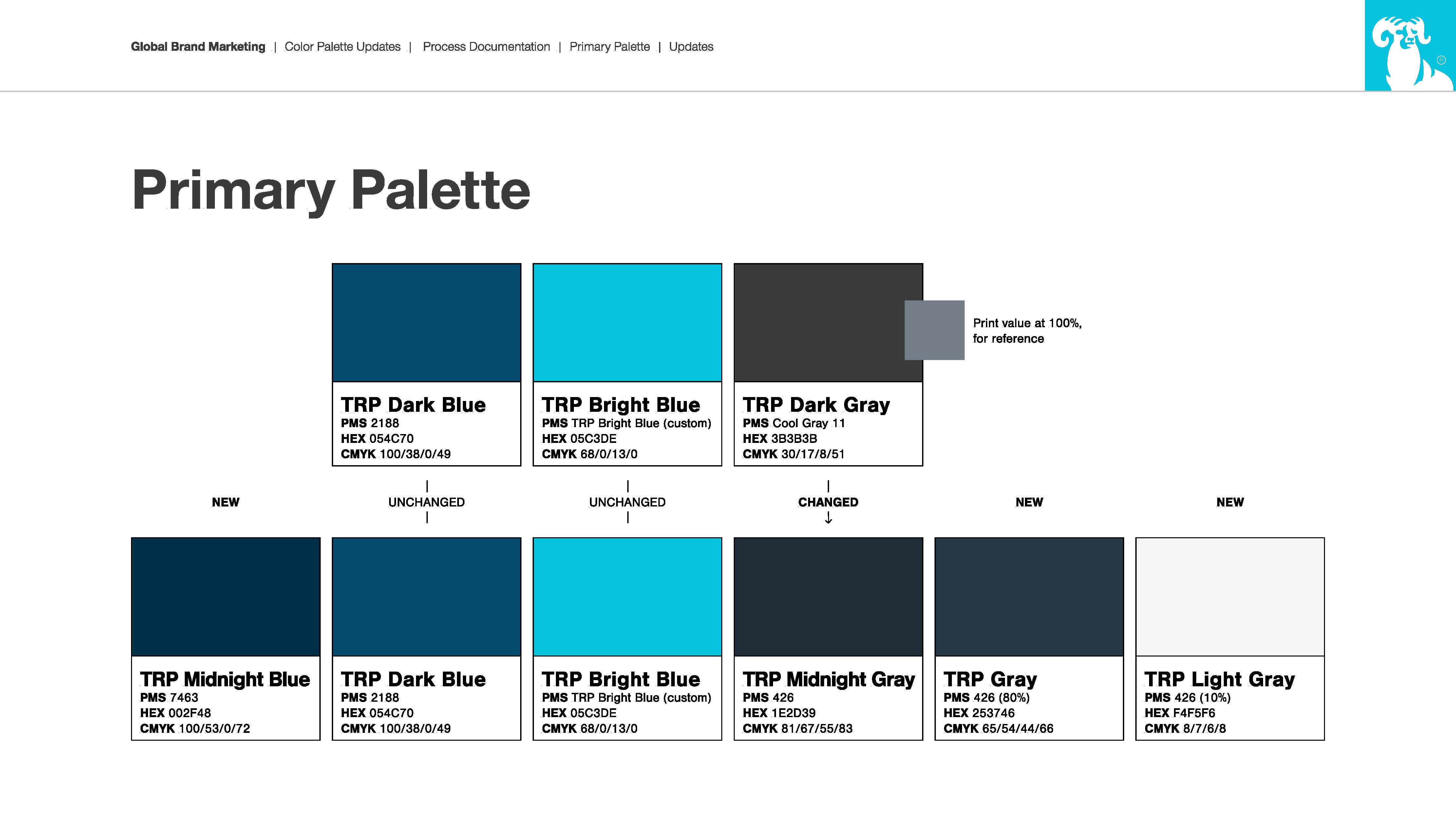
With all of the information collected, I analyzed it to determine what patterns emerged across all of our internal and external audiences. With a clearer understanding of the problem, I then defined the MVP for the color system that addressed all of the major pain points described. The research provided the direction that we needed to evolve our two-palette color system (core and functional) into a four-part system (core, functional, chart, special events/causes) I socialized the findings with senior leaders and walked them through my approach for developing the system. Once buy in was achieved, we advanced to the next step.
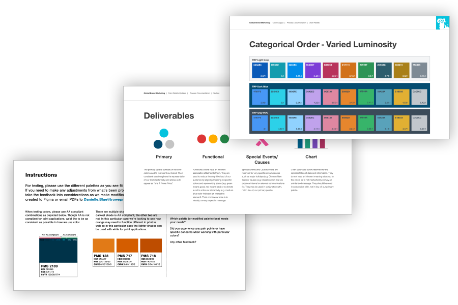
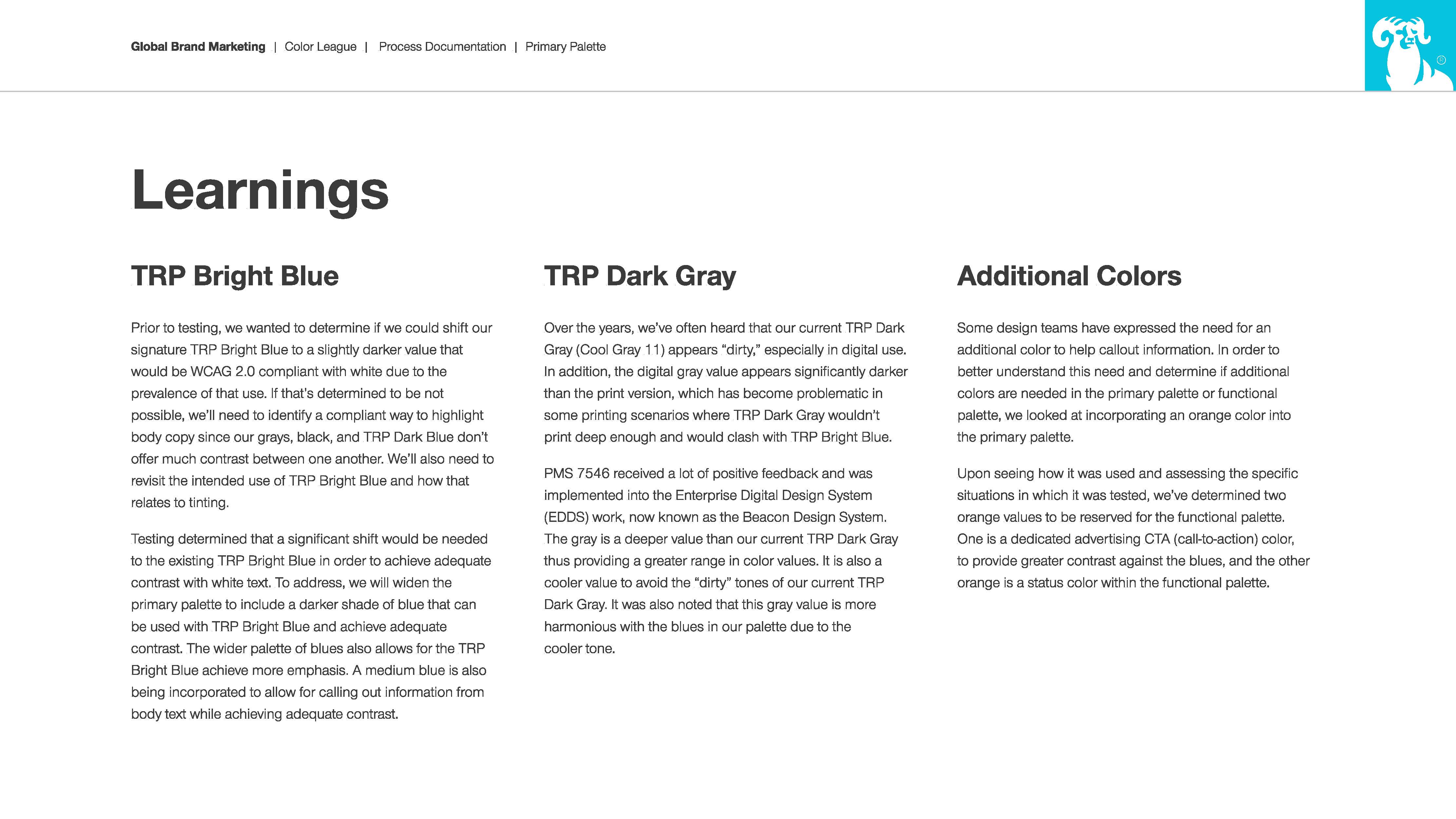
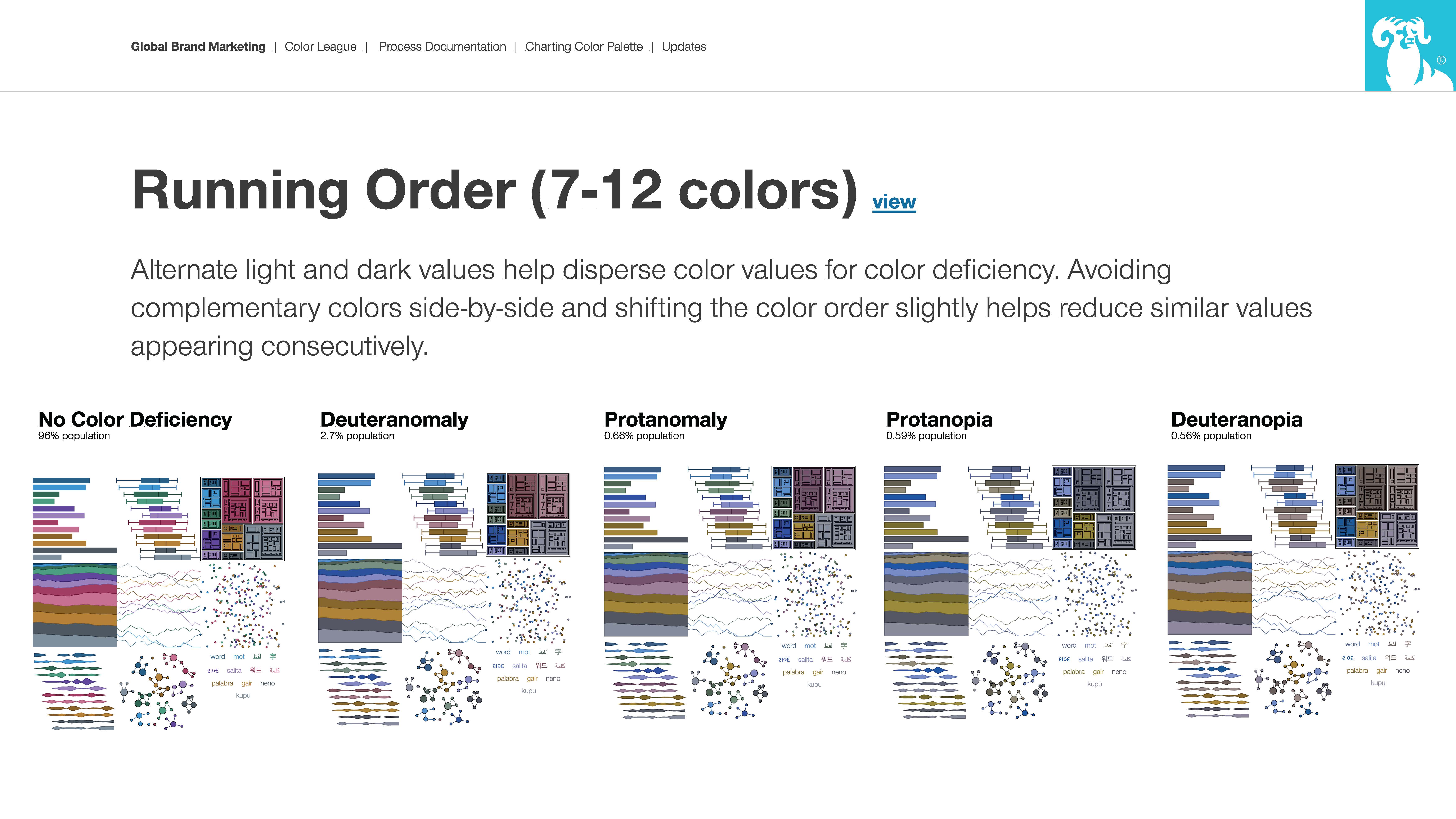
With the parameters determined, I created a more robust straw plan for how to address the problems specifically. I then developed a series of workshops, with consultation from one of the digital agencies we partner with, to ensure that all media types were thoroughly considered. I identified over 40 practitioners and SMEs from across the firm that supported a variety of audiences and performed a variety of roles to be involved. Prior to these workshops kicking off, two to four sessions for each subset of the color palette, I developed some initial recommendations based on the research for the teams to stress test and iterate on to give the teams a baseline to begin with. The initial recommendations were vetted against WCAG 2.0 requirements to ensure accessibility.
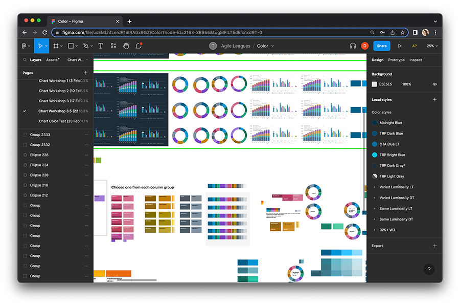
• Once the workshops kicked off, each participant would bring current or previous work that was considered critical communications for their audiences. We would include business-as-usual materials, data heavy, high touch, and any outliers—all with the goal of applying different types of pressure on the palettes to identify any friction we’d need to address. A variety of touchpoints were also considered, such as video, print, web, email, social, event, and presentation. Throughout the workshops the teams would identify challenges or successes for different options, collaborate with one another, iterate, and together we determined the most viable solution for each palette.
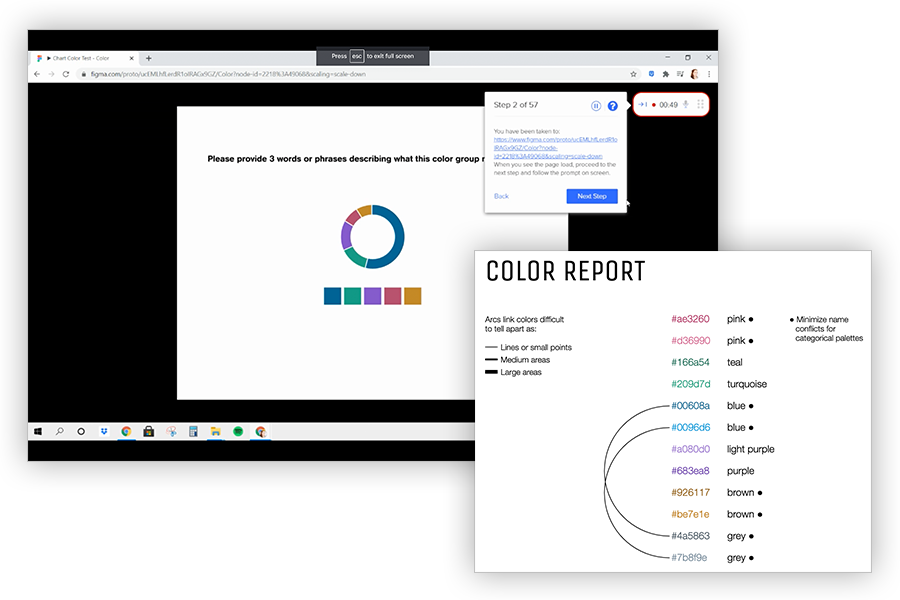
• With our recommendation prepared, we completed a final round of accessibility testing before completing external user testing. I leveraged our UserTesting.com account to target specific demographics and set up the tests. Once we had our findings, we made adjustments based on the feedback and translated the digital colors into Pantone PMS colors for printing and completed print tests to validate those values compared to their digital counterparts. Once we were satisfied with the results, we prepared the recommendation for socialization with senior leadership for final approval.
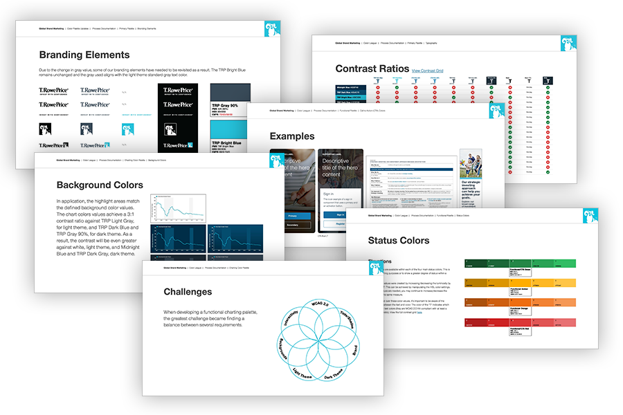
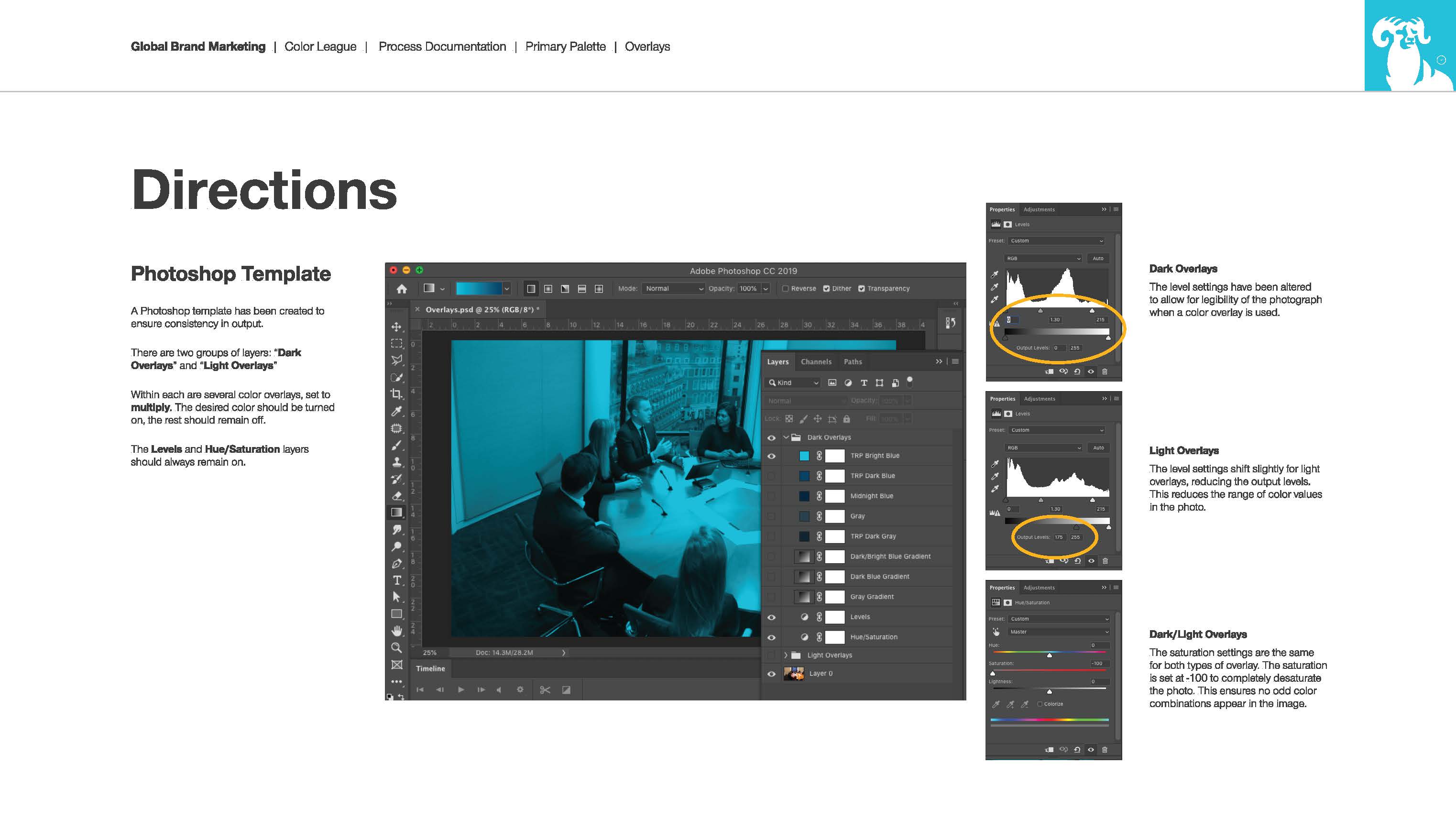
After the new system was approved, I wrote up the formal guidelines and myself and our brand managers began socialization across the firm. This included sharing a remediation plan to move legacy and current work into the new system and drive greater consistency across our materials. We held coordination calls with our business segments and external vendors, lunch and learns with our design community, and held trainings with other job functions. I also scaled the system across our Microsoft and Adobe systems and worked with other teams to complete remediation on their systems.